
Data Visualizations
Introduction
Before we could begin data manipulation on the set of digitized death records that were given to us, we first needed to take some time to understand how the data was set up. Some of the main aspects we were concerned with understanding included the number of fields, number of records, amount of null/blank values, quantitative vs qualitative data, inconsistencies, and anything else that sparked our interest. After taking some time to understand how the data was set up, we decided to tackle the issue of inconsistent death causes. We chose this issue because much of the class was interested in what people were dying of. The dataset we had could not produce that information without cleaning and manipulation first.
When looking at the causes of death, we found that there were 445 different causes listed across the 3405 records. Given the number of different causes, we decided to add categories of death to the records. This would help the class make quick inferences about what people were dying of in Athens during the 1920s. When assigning the death categories to each record, we decided to write a script in Python that would help speed up the process of categorization. We chose to use Python over Excel because Python has many packages that can assist in data cleansing and manipulation. The script essentially looked at the cause of death and added a category value to the new death category field that was created. In the case of multiple causes being listed, the script was set up to take the left most cause. This decision was based on the assumption that the first cause of death listed was the main cause. After the script was completed, we looked through the records to make sure everything had run as expected. We then repeated this same process to categorize the occupations listed on the death records. Thanks to this automation, many hours of manual data entry were saved. This gave us the opportunity to answer more of the questions that were posed by the rest of the class.
After the causes of death were categorized, we loaded the data back into Excel. Once the data was back in Excel, we created a Pivot Table which would allow the class to filter all the death records based on the cause of death category. In addition to the cause of death categories, we also included race, sex, year of death, and occupation. These filters could be combined to help answer interesting questions. For example, someone could figure out the average age of death of African American women who died of cancer in 1924 (the answer is 52.86). By creating this table, we empowered the rest of the class to answer all the questions they had asked us and maybe even some that they had not thought of yet.
On this map, you can see several clusters of race and income. For example, on the Southwest corner of the map, there is a large cluster of low and middle income African Americans. There are similar clusters on the Northern center of the map, as well as on the Northeastern corner of the map, and in the center. These clusters are even more visible on the map below, on which you can see clearly segregated neighborhoods of African Americans. In contrast, the Northwestern corner of the map shows a clearly segregated Caucasian area of the map. Most of the high income earners are focused on the center of the map, with a few scattered people around the corners. The vast majority of the N/A income tier are housewives, which is why they are found all over the maps. The more rural areas of the map, around the border, are made up primarily of low income African Americans.
Graphic Overview
Race Graphs


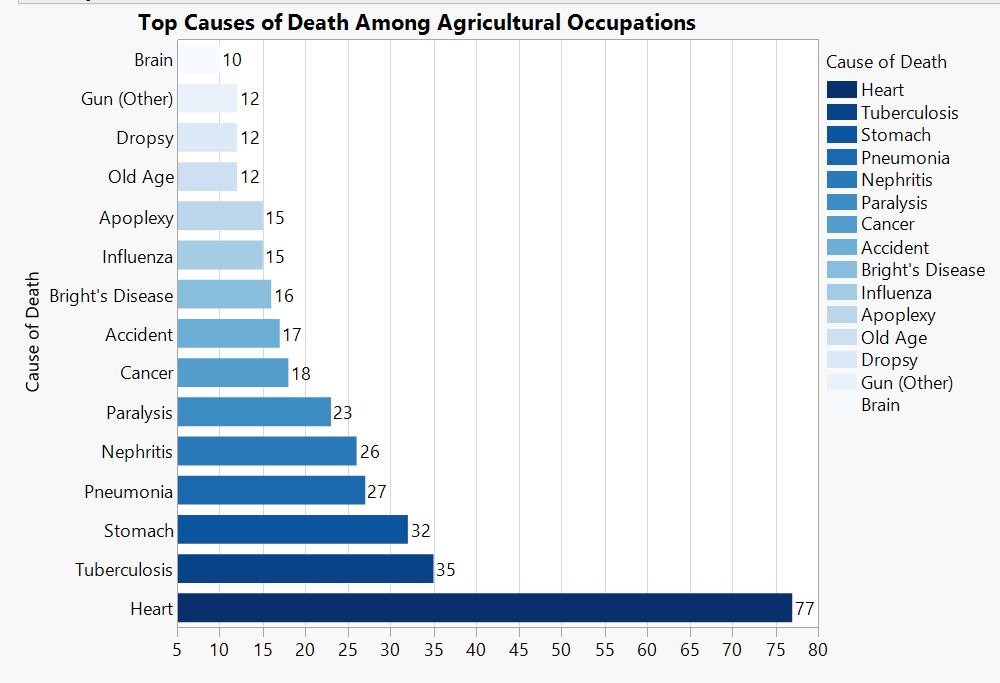
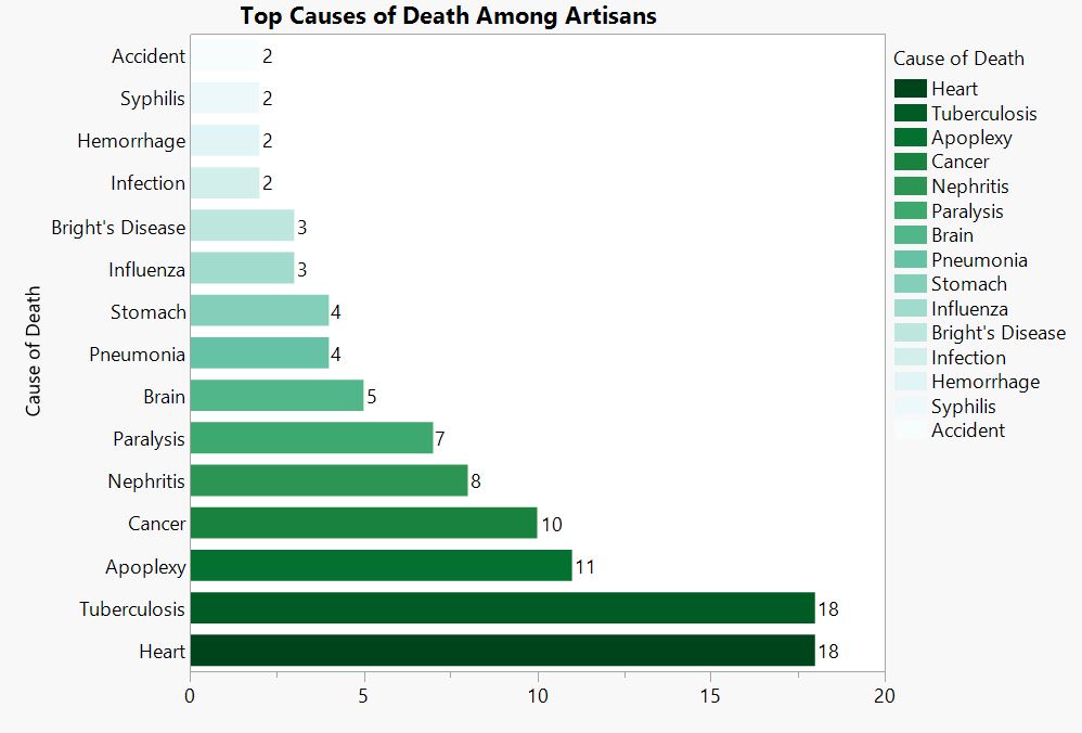
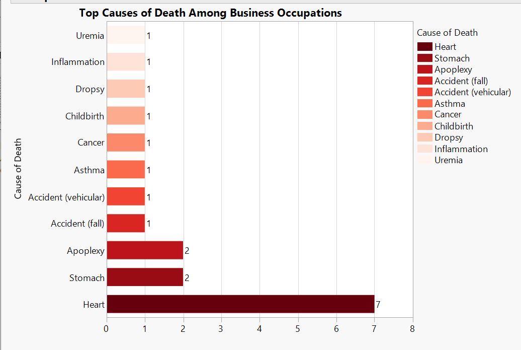
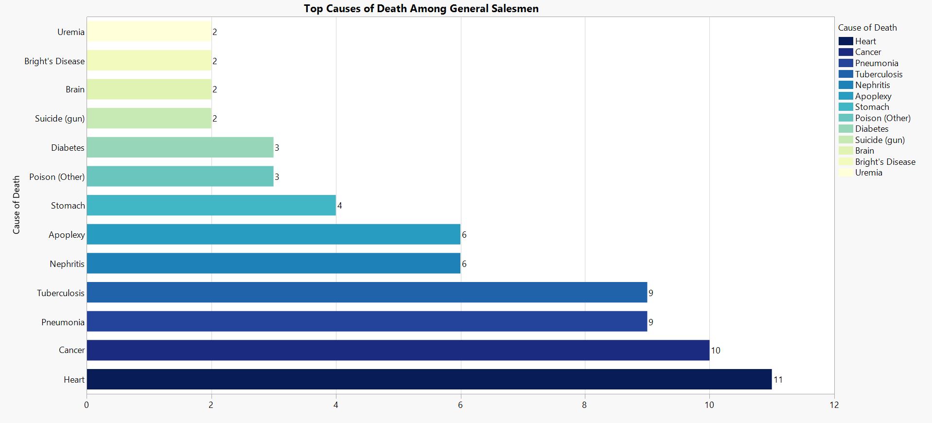
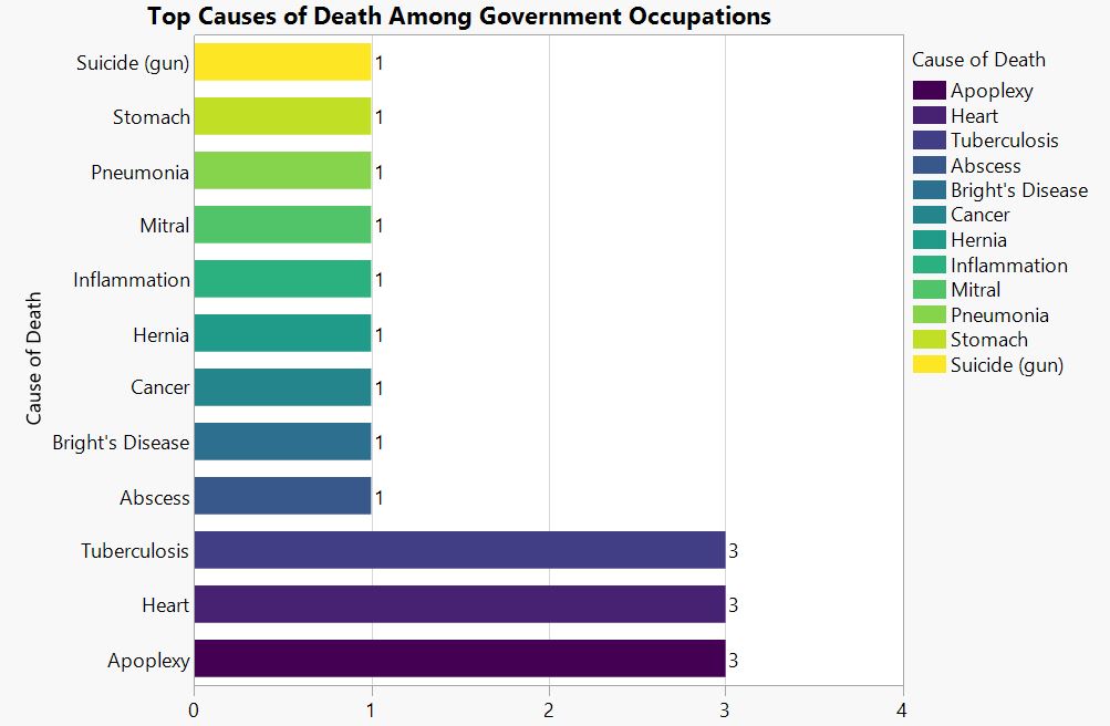
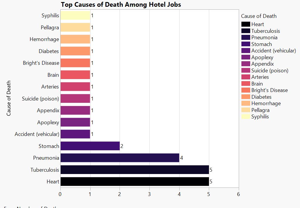
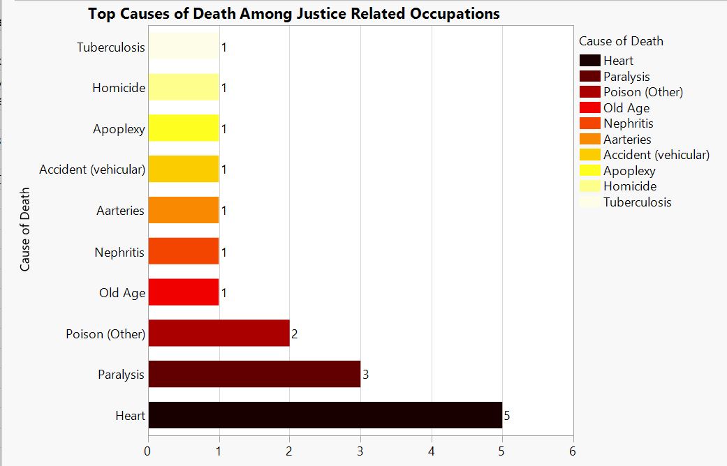
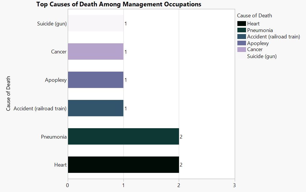
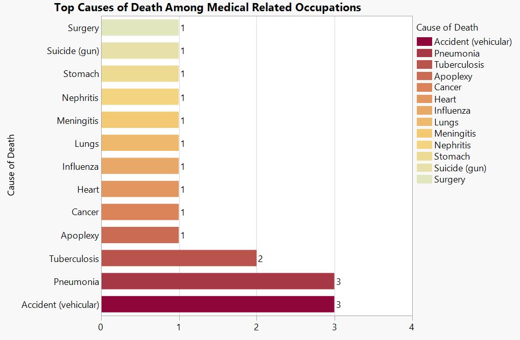
Occupation Graphs
![]()


at__media_original" src="/sites/default/files/library/graphs/Top%20Causes%20of%20Death%20Among%20Military%20Occupations.JPG" typeof="foaf:Image" width="1252" />
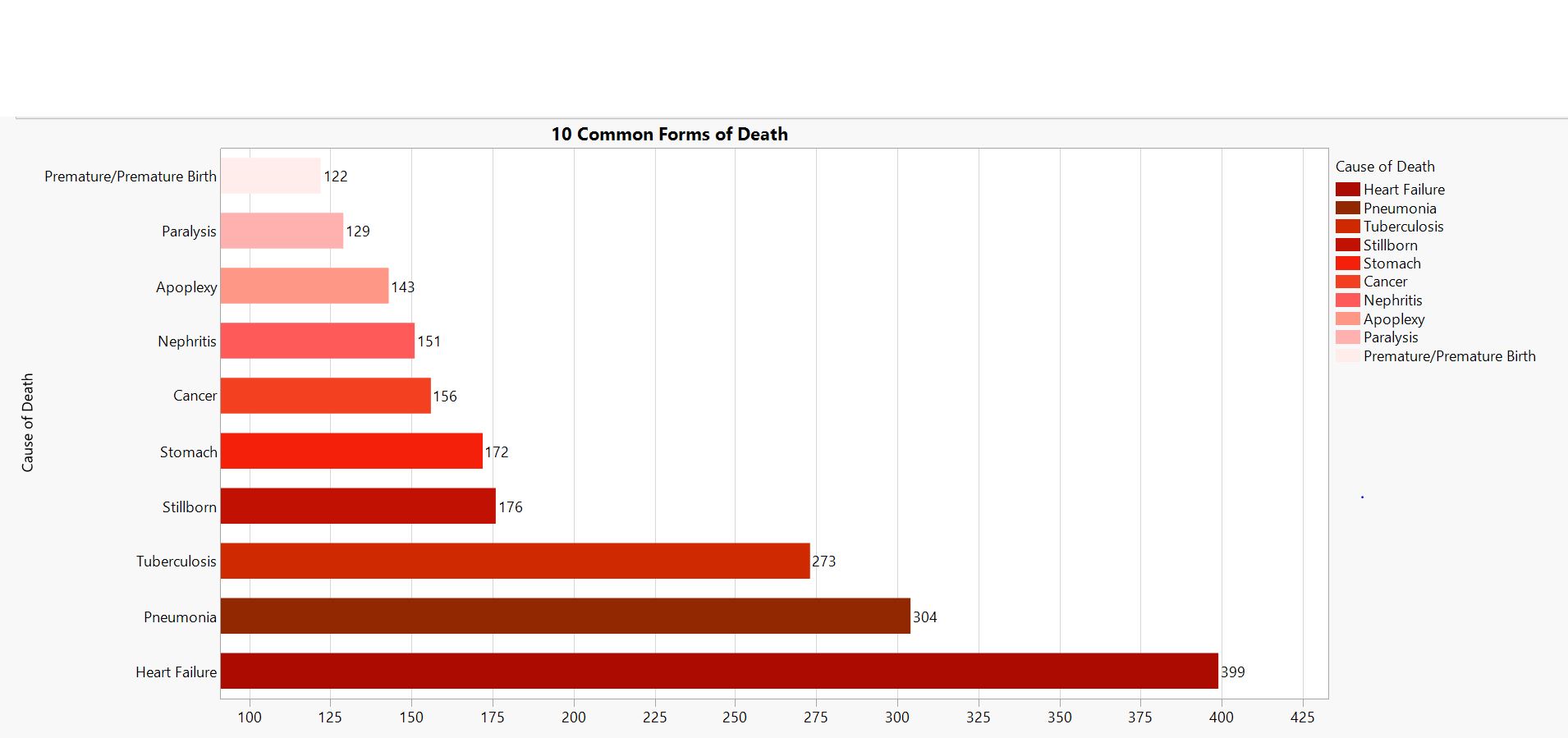
Caption.
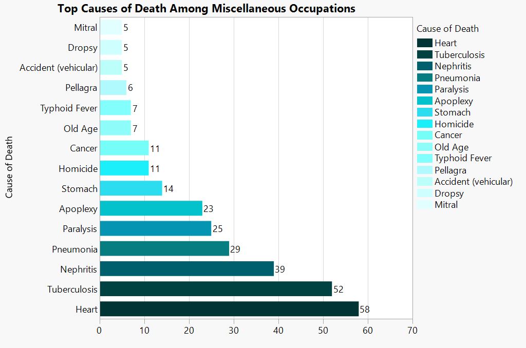
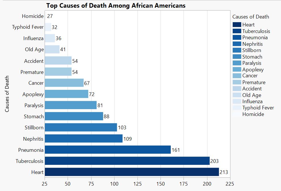
Caption.
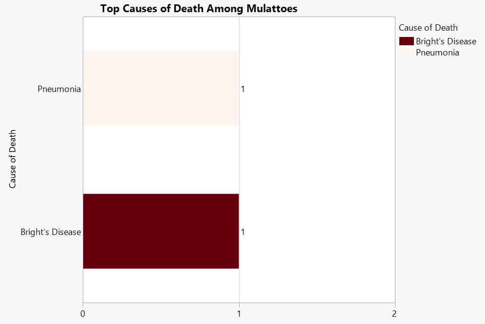
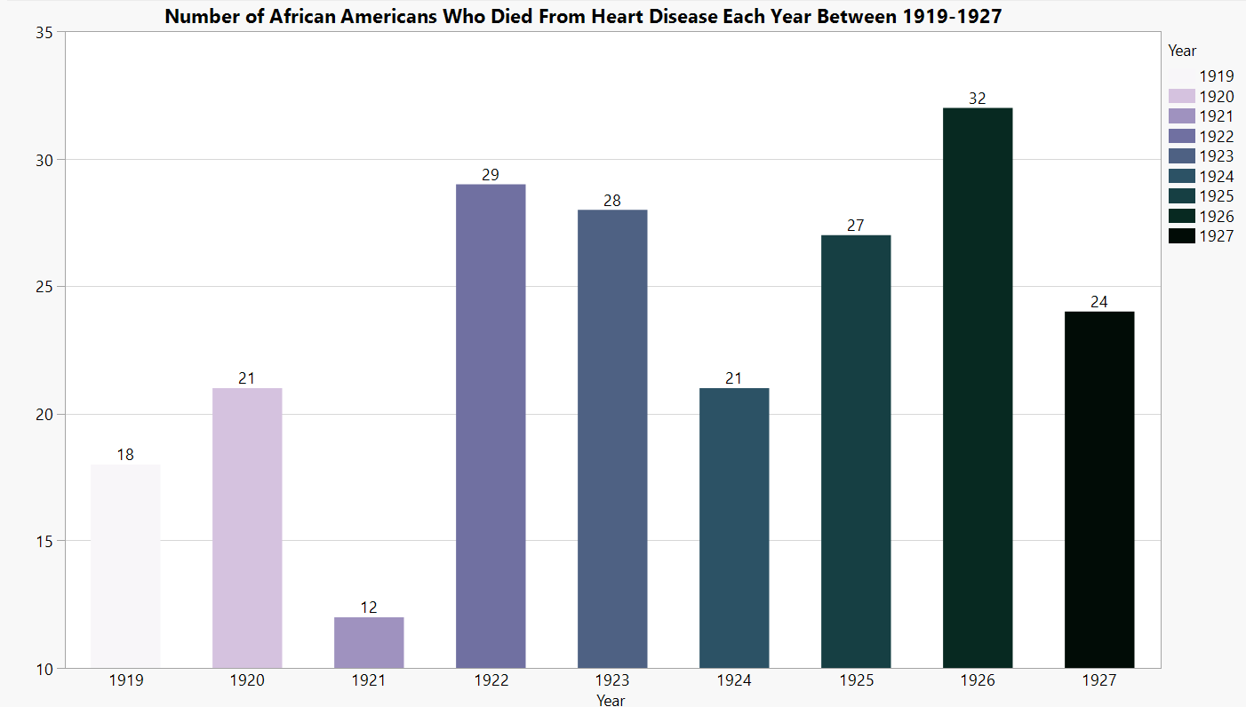
Caption.
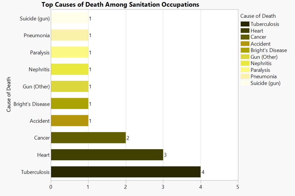
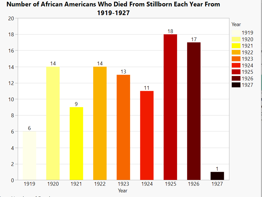
Caption.
Caption.
Caption.
![]()
Credits
Dalton Sherrod, Jalen Granski, Braden Pressman, Shai Shalev, Connor Herbert, Jacob Euster, Aliann Xu, Eli Klenberg