
Space and Social Justice
These maps display the income levels and spatial distribution of the Athens, 1919-1928. The first thing that is obvious is the general sprawl of the white population. While there is a cluster on the northern part of town the population went all throughout the city. This is in stark contrast to the African American distribution which perfectly demonstrated how the neighborhoods in Athens were segregated. It’s also clear which neighborhoods were predominantly African American even by looking at these maps because there is a distinct lack of dots in certain areas. Another noteworthy point is that each neighborhood has a variety of income levels living in relatively close proximity. The few high income dots make an appearance in basically every neighborhood (although they do get less frequent as the location gets more rural) while the rest stretch out as usual. Each of the dots listed with a “N/A” indicates someone marked on their death certificate as a housewife, as they did not have an income level.

On this map, you can see several clusters of race and income. For example, on the Southwest corner of the map, there is a large cluster of low and middle income African Americans. There are similar clusters on the Northern center of the map, as well as on the Northeastern corner of the map, and in the center. These clusters are even more visible on the map below, on which you can see clearly segregated neighborhoods of African Americans. In contrast, the Northwestern corner of the map shows a clearly segregated Caucasian area of the map. Most of the high income earners are focused on the center of the map, with a few scattered people around the corners. The vast majority of the N/A income tier are housewives, which is why they are found all over the maps. The more rural areas of the map, around the border, are made up primarily of low income African Americans.
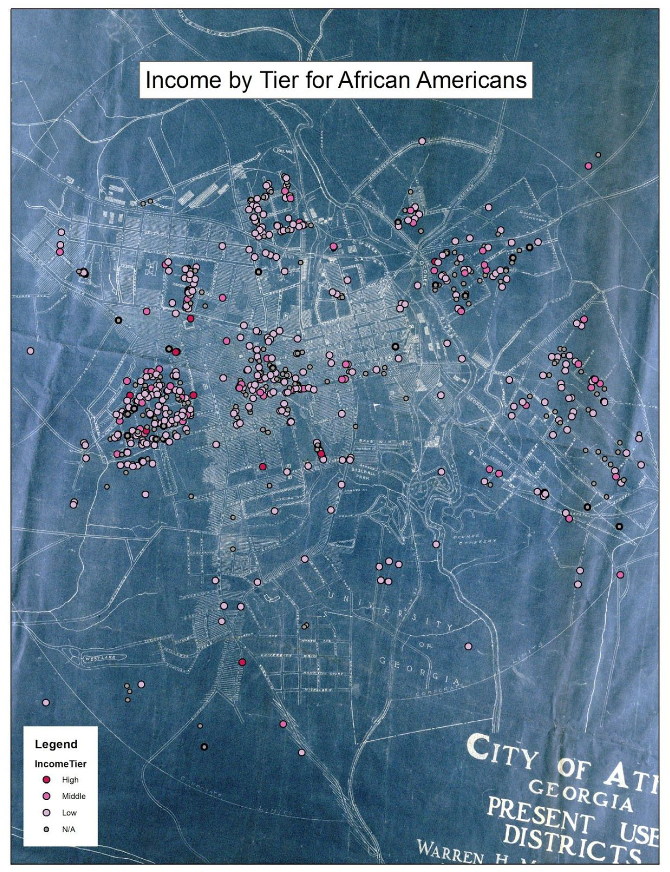
This map demonstrates the income by tier level for African American citizens of Athens. 6 clearly delineated segregated neighborhood clusters appear on this map, all of which appear in a circle around the Northern center of the map. These neighborhood clusters are interesting, because they do not show up nearly as clearly in the Causcasian income by tier map. This indicates a clearer sense of neighborhood cohesion in African American neighborhoods than in Caucasian neighborhoods. Most low and middle income African American people lived in these particular structures. The other sporadic low income workers on randomized areas of the map are likely domestic workers, housekeepers who lived in the houses of higher income Caucasian families. Higher income African Americans typically lived isolated away from other African Americans, typically in areas dominated by Caucasians. Additionally, the vast majority of African American death certificates indicated low income tier occupations. This differs from the Caucasian map, which has greater variety of income tiers.
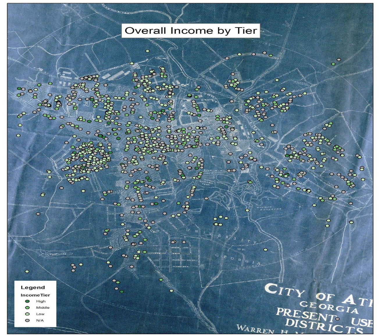
This map is a general combination of each of the previous maps we have displayed. Just by viewing the overall income of every person who died during this time one can see the clearly drawn lines of segregated neighborhoods. While there were plenty of low income Caucasian residents in Athens, their residences were spread throughout town and intermingled, something that is particularly evident in the northwest corner of the map. Each of the neighborhoods shown in the African American map appear here as more distinct clusters of lower income individuals further away from the center of the map. This also helps display just how many housewives and home workers were in the area as housewives are shown as “N/A” income and workers are shown as low with them often immediately below middle/high income markers.
Credits
Griffin Hamstead, Mason Cantrell, Sailor Nicholas, Lacey Ewers, and Lindsay Brink